Finding Second Hand Car Deals with Python and Matplotlib
Amidst a global pandemic where people have been urged to stay indoors and in an economy that’s dropping harder than a WhatsApp video call, I developed the urge to purchase my first new, but not “new new”, car.
After spending a couple of weeks digging through pages of second-hand marketplaces, twisting all the different knobs of price, year, mileage, make, model and my expectations I came to the conclusion that trying to find a good deal sucks. You start with something in mind “A Ford Fiesta would be nice, my budget is R100,000, but the mileage at that price is way higher than I would like to pay, so maybe spend a bit more or get the higher mileage, but what about the year….” So many factors, digging through pages of results, switching settings, trying to compare so many different factors, it exhausting.
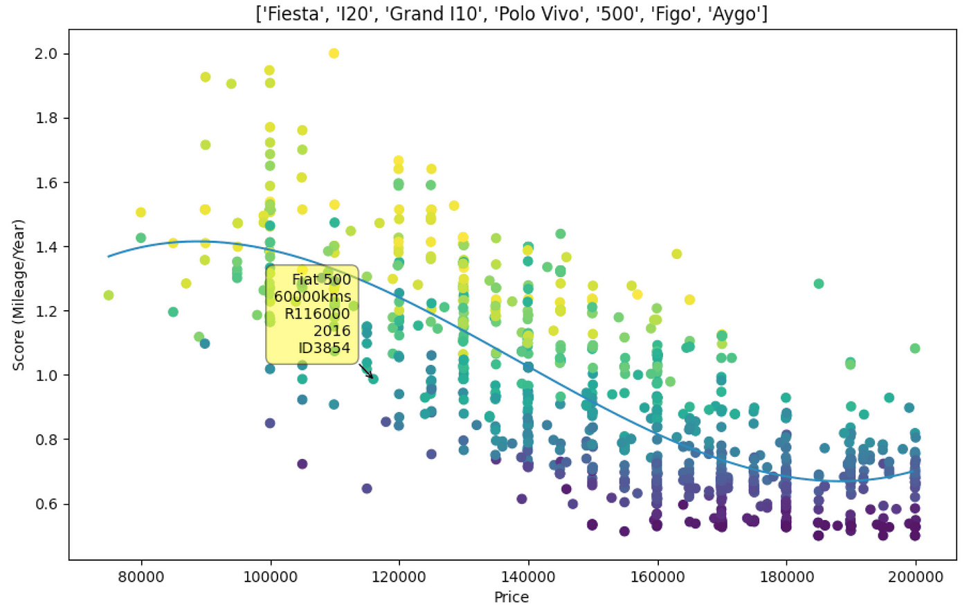
At one point I was looking at Fiat 500’s, and I saw one that had good mileage and a decent year but based on all the reference I had developed in my head I thought it was overpriced. This was an itch of a thought, “what if I could take all the Fiat 500’s and take the various combinations of years, prices and mileages and plot a graph to see where this particular one stacks up”.
Scraping the Data
The platforms I browsed most were Gumtree.co.za, Facebook Marketplace, Cars.co.za and Autotrader.co.za, of the 4 I found myself spending the most time on Gumtree (there is a lot of overlap across sites too). For the first iteration, I went to a specific search, eg. Volkswagen Polo Vivo and grabbed the URL which looked like below and separated, the fields for price, year, mileage into variables so I could adjust my search later.
https://www.gumtree.co.za/s-cars-bakkies/western-cape/volkswagen~polo-vivo/page-2/v1c9077l3100001a2mamop2?cy=2014,2021&pr=70000,200000&km=,100000
You’ll notice there’s this unique identifier v1c9077l3100001a2mamop2 which relates to each search so I couldn’t just change the “/volkswagen~polo-vivo/” section to change search results. Another thing to note is that the last digit of that unique identifier is a duplicate of the page number which took me a while to figure out.
Once I figured out the URL formula I used the Requests package, for making HTTP requests, and the BeautifulSoup package for parsing the HTML, pulling out the specific data and adding it to a CSV file like so.
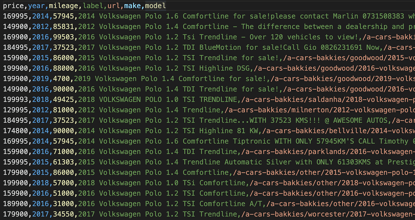
I did this manually for each vehicle I was interested in.
Plotting the First Graph
So the first graph looked something like this, quite basic, stuff in the bottom left quadrant would be better I suppose.
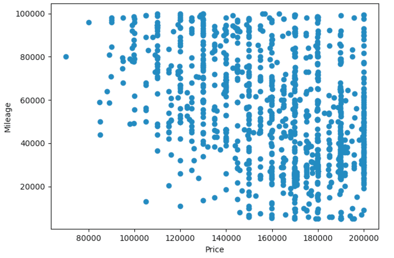
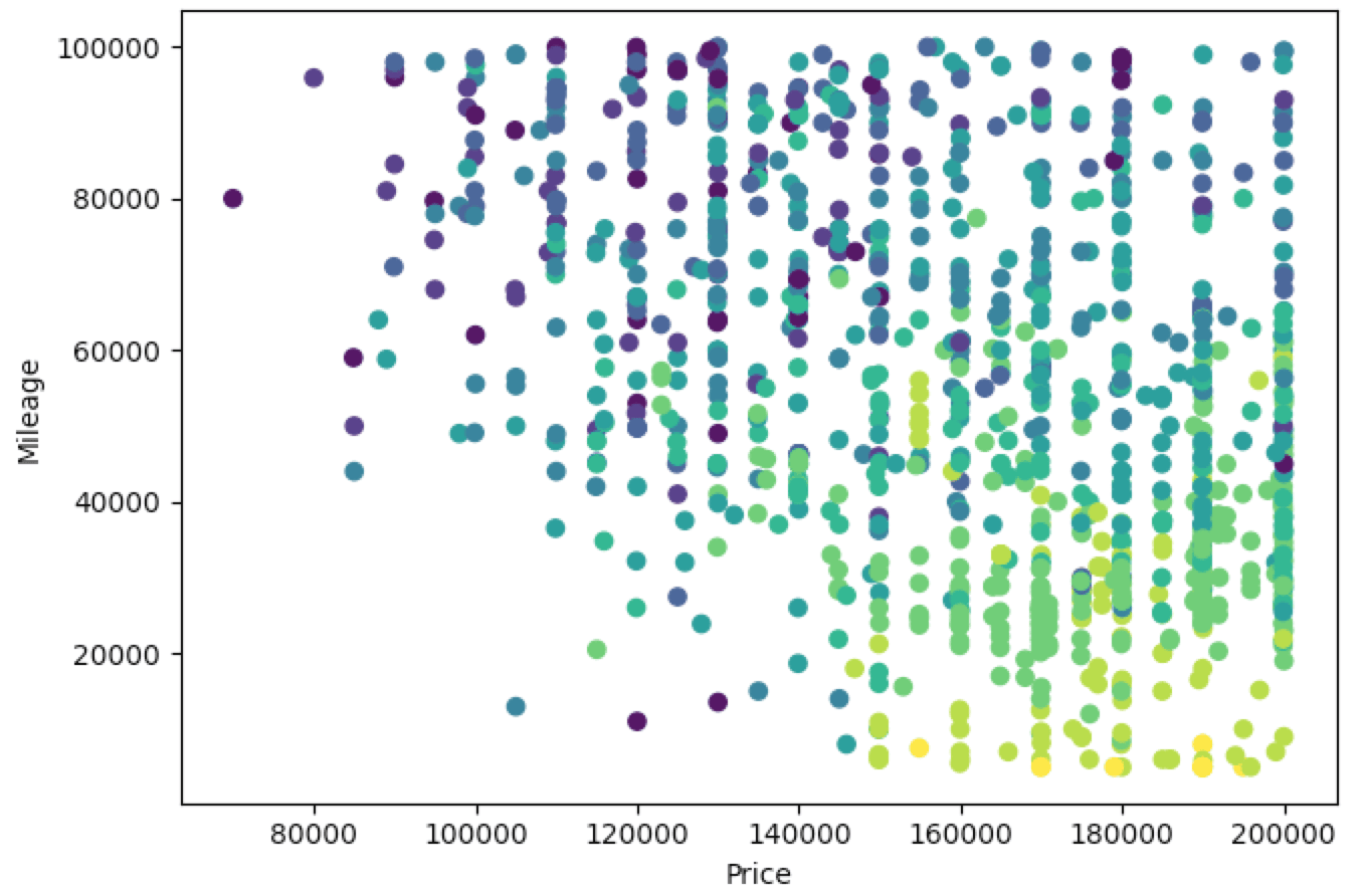
The next thing I did is colour code the points based on the model year because this is one of the three big factors to consider, a cheap car with low mileage that’s 30 years old isn’t necessarily a good thing.
So in the below, newer cars are lighter (yellow) and older cars are darker (dark blue). This gives us a better idea, so if we’re looking in the bottom left quadrant at 20000/190000 there’s a fairly light green dot which is probably a good deal. Actually, which car is that 🤔…
Getting Labels
So the next step after plotting everything was to be able to identify individual points. So here I used the Mplcursors package to allow hovering of specific points and pulling up their data. (Note: There was a lot of copy-pasting from Stack Overflow here, I’m not a data scientist and I have a basic understanding of Pandas and Matplotlib and pretty much had to search everything).
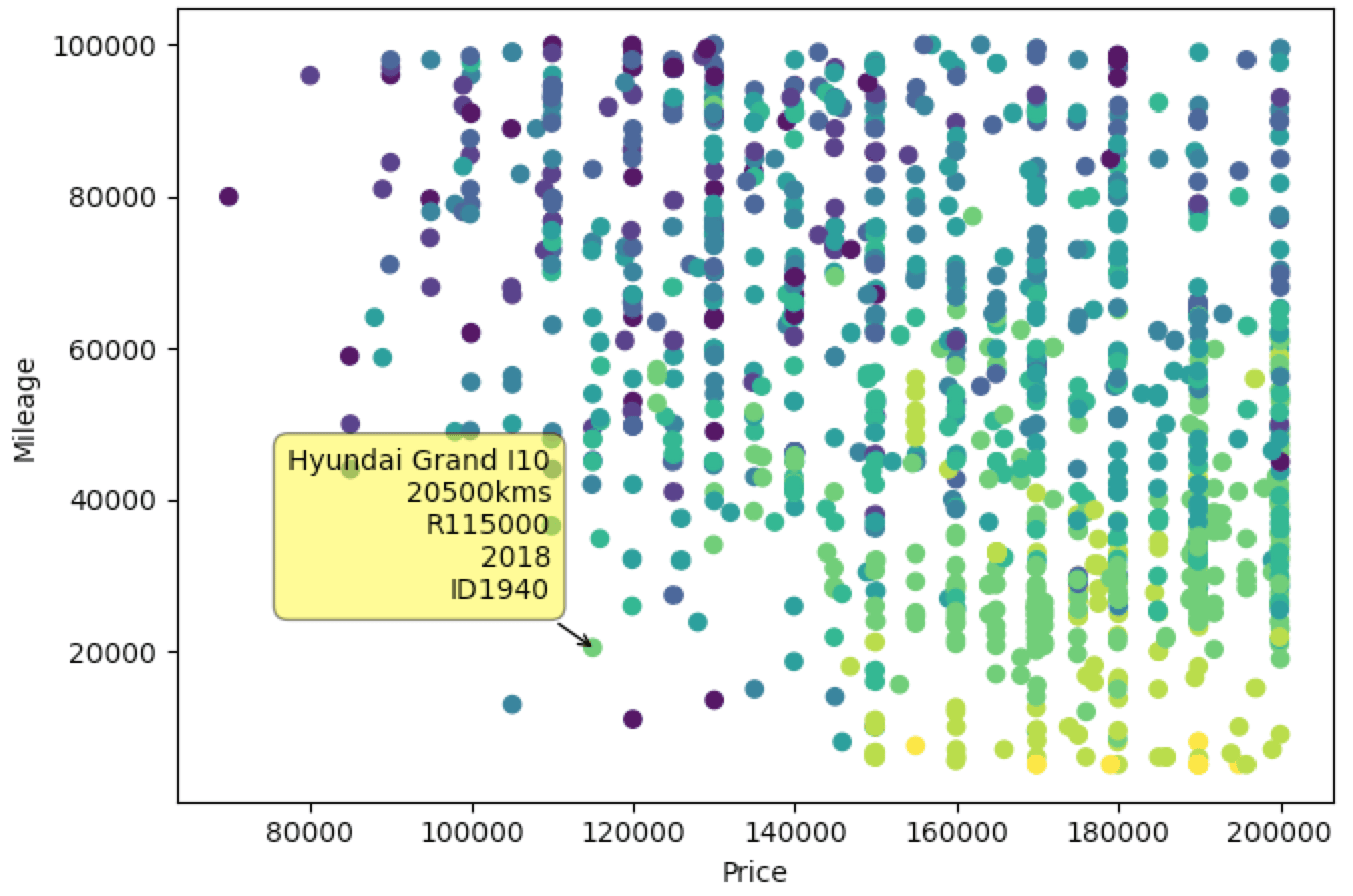
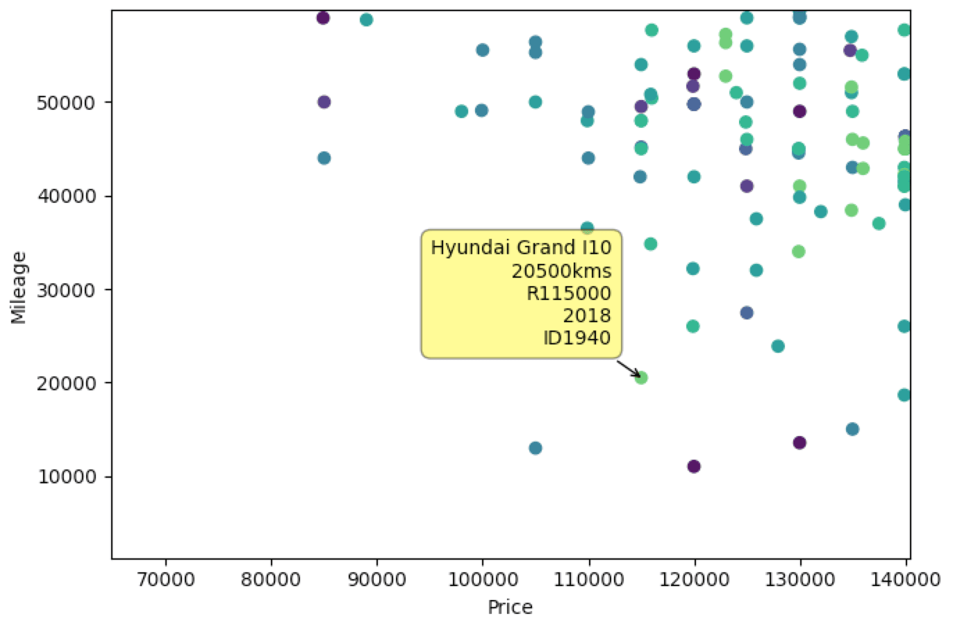
Nice, so now we have labels that show the relevant information. You can also see I added a unique ID which corresponds to the row in the CSV so if I can grab the URL from there to check the car out later.
Comparing Price & Year
So although the coloured points help identify better/worse deals in terms of a year, it does depend a lot on your ability to distinguish between shades of colour.
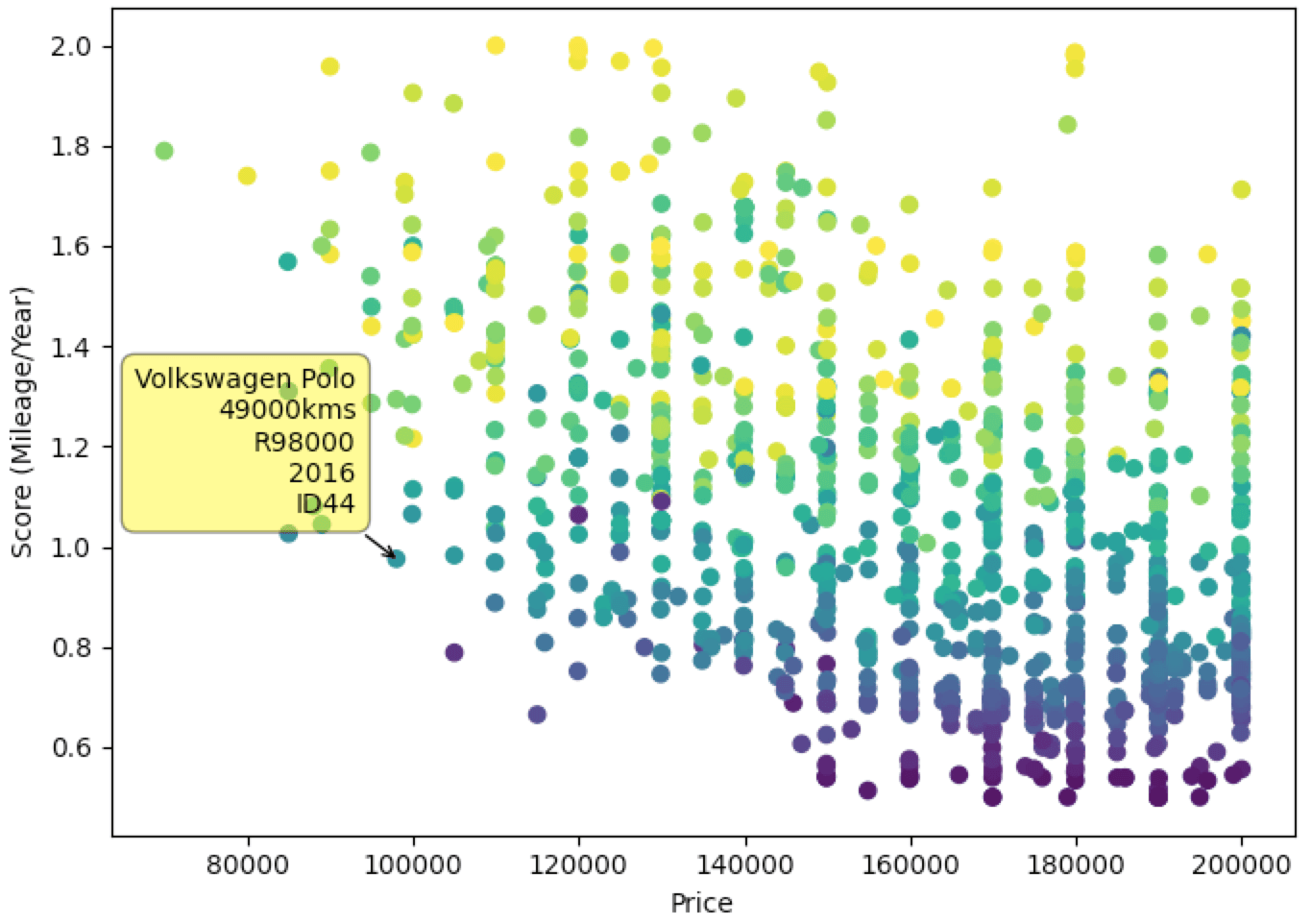
So I thought let’s create a Score value, that is Mileage/Year. First, we need to normalize the values to be between 0 and 1 and then we’re going to divide the normalized mileage by the normalized year to get a score value and plot this on the y-axis instead. Unfortunately not being a mathematician or data scientist, I’m not sure what the optimal formula or weighting would have been but this is just for fun so let’s move on.
So here we can see the Score/Price plot, lower score is better. The colour now represents mileage (lighter=higher, darker=lower), so again we’re looking in the bottom left quadrant or right depending on budget. The colours here aren’t an indicator of anything useful, a darker colour means lower mileage but depending on where it is on the y-axis represents the trade-off in year. In the bottom right where you have a lot of low scores, that’s most recent models 2018–2020 with low mileage but of course, you’re paying a lot more for them.
Trendline/Polyfit Curve 🤔 🤷♂
So looking at this data and going back to the original thought that started me down this rabbit hole I thought let’s add a trendline and anything above the line is overpriced and anything below the line is a fair/good deal
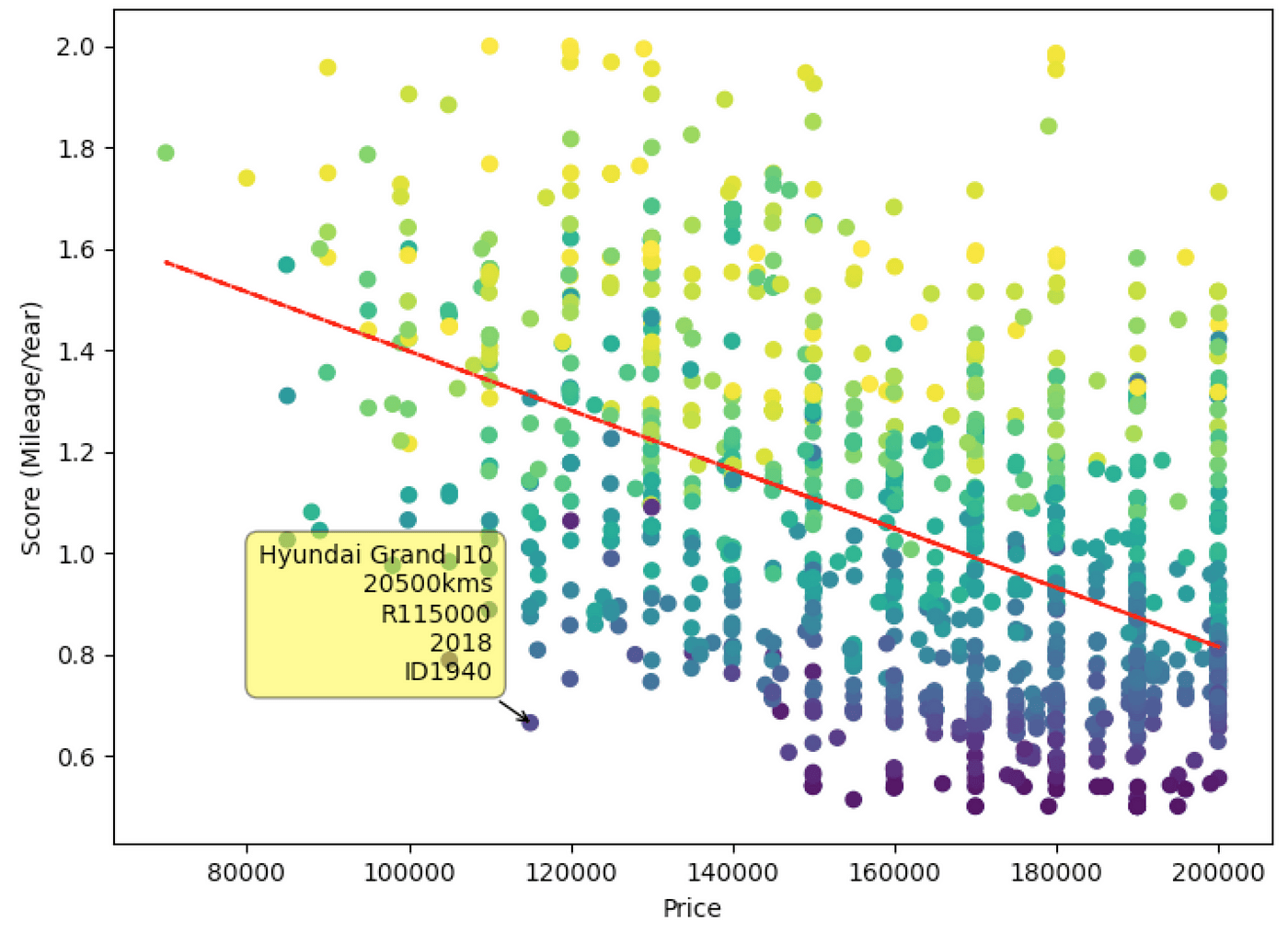
Cool so here we have a trendline, the further a point is below the line, the better the deal, seems pretty straight forward. There does seem to be a bit of a curve to the data though so we need a curve that’s averaging all the factors. So here I have no idea how this works mathematically, I just grabbed some bits and piece of code online and made it work.
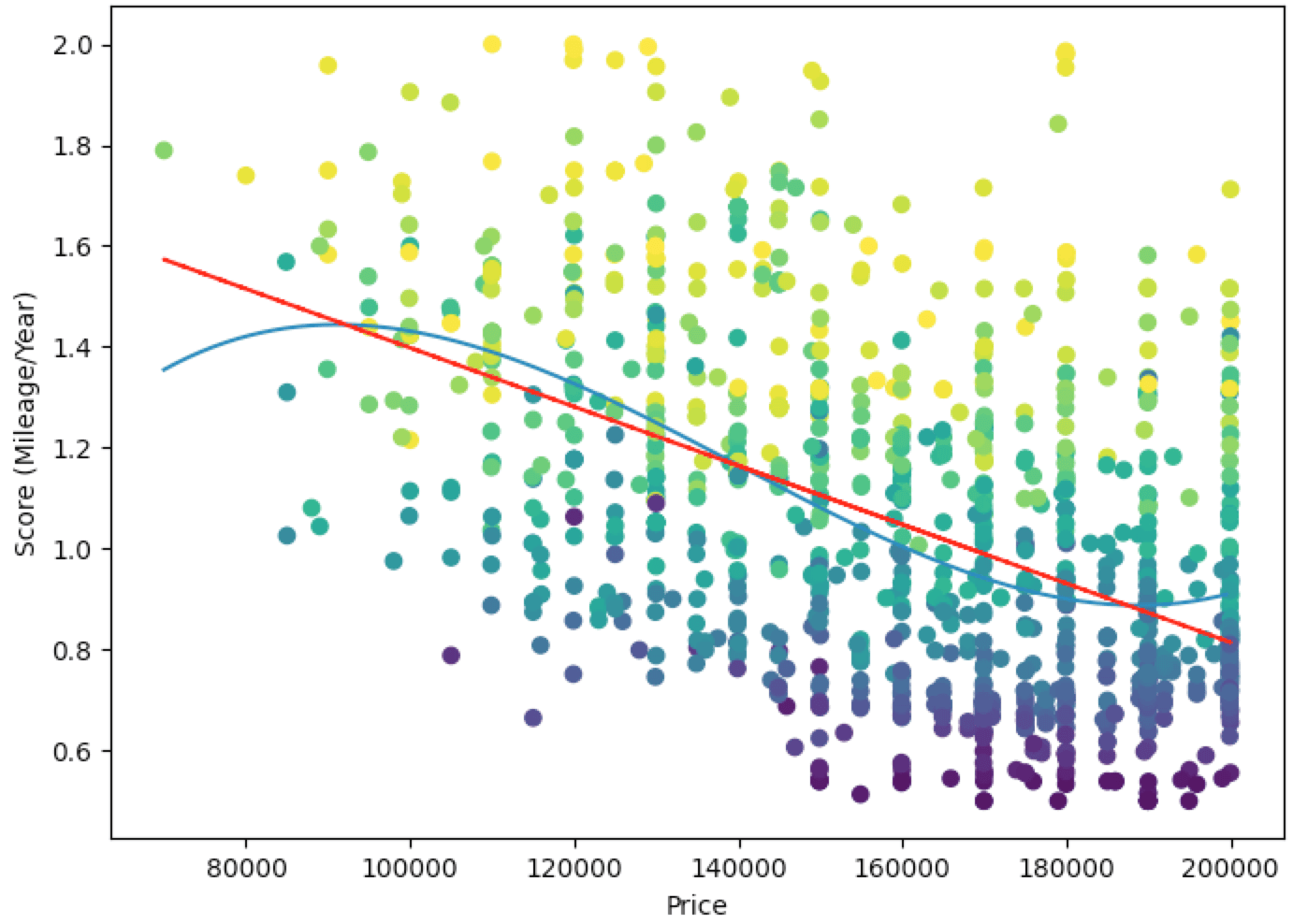
Nice, so now we have a curve which better represents the value of a car. The two outliers on the bottom left quadrant seem like pretty good deals. Also after this, I removed the trendline as it didn’t seem as important.
Scraping Everything
At this point I thought, more data = better. So I modified my original scraping script to get each make & model and each unique identifier and just scrape all the data (still within specific parameters of price/year/mileage). So now I have all the vehicles under 100,000kms, between R70,000-R200,000 and newer than 2012. This is what that looks like.
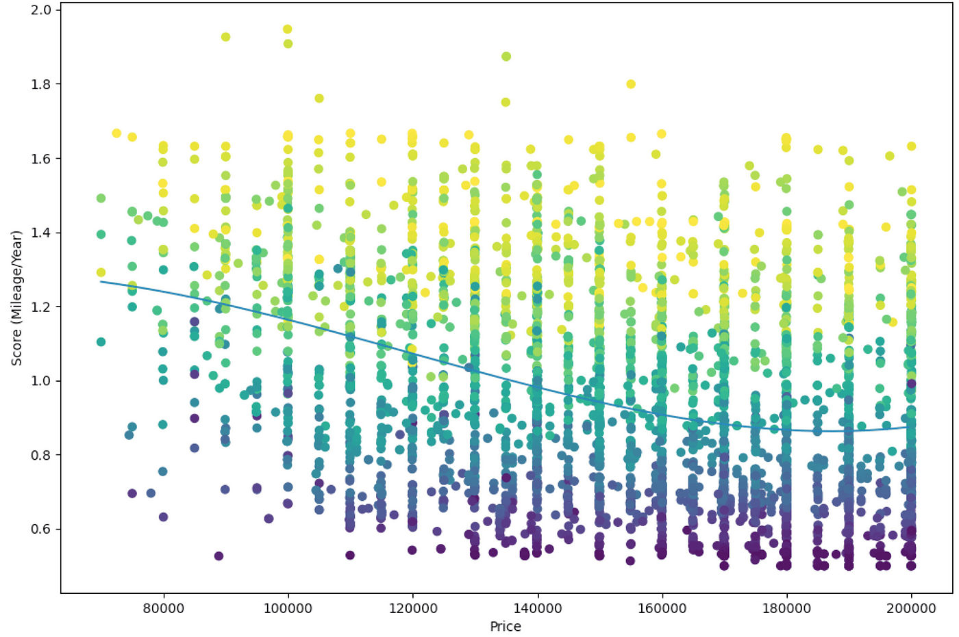
Although informative, comparing every car against every other car isn’t that helpful. Some cars are of much lower quality, you need to handpick a select group of cars in a similar price bracket to make a fair comparison. In the above example, the bottom area is filled with Renault Kwids, Datsun Gos, Suzuki Celerios and some Kia Picantos.
Adding Features
From here I started adding features, so you can specify specific Makes and Models.
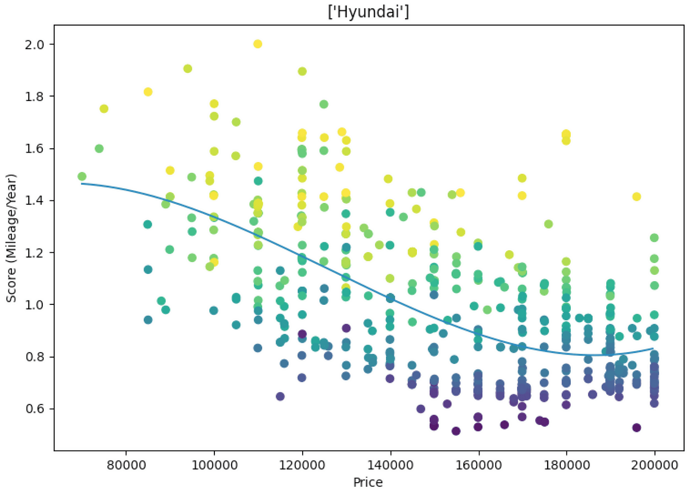
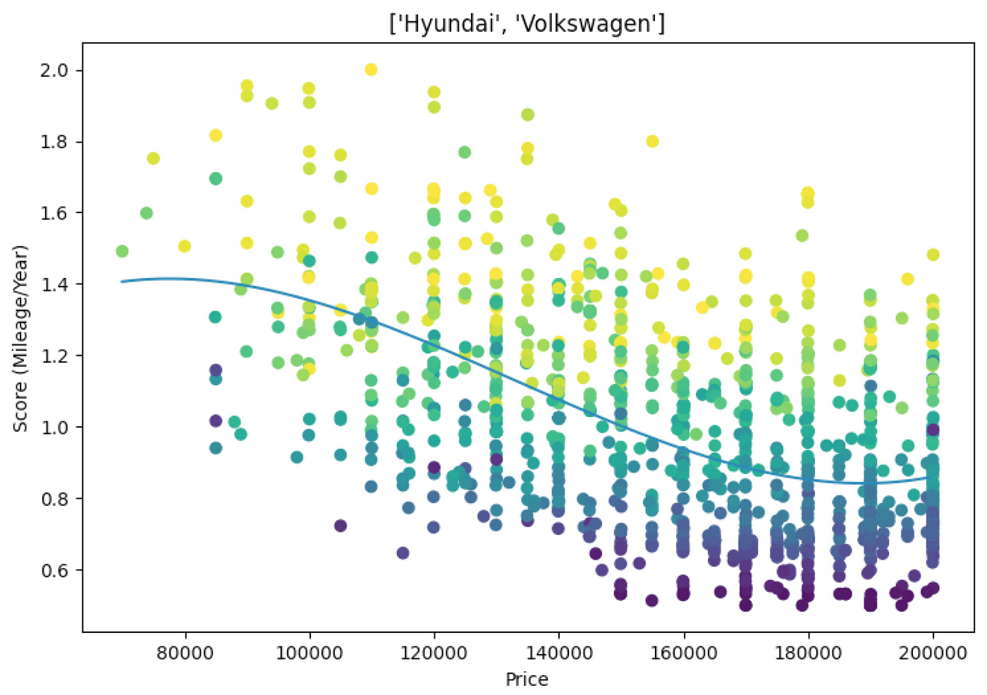
Filtering by Make is quite general, it makes more sense to filter by a model or models in a similar category, for example, Ford Fiesta and Hyundai I20
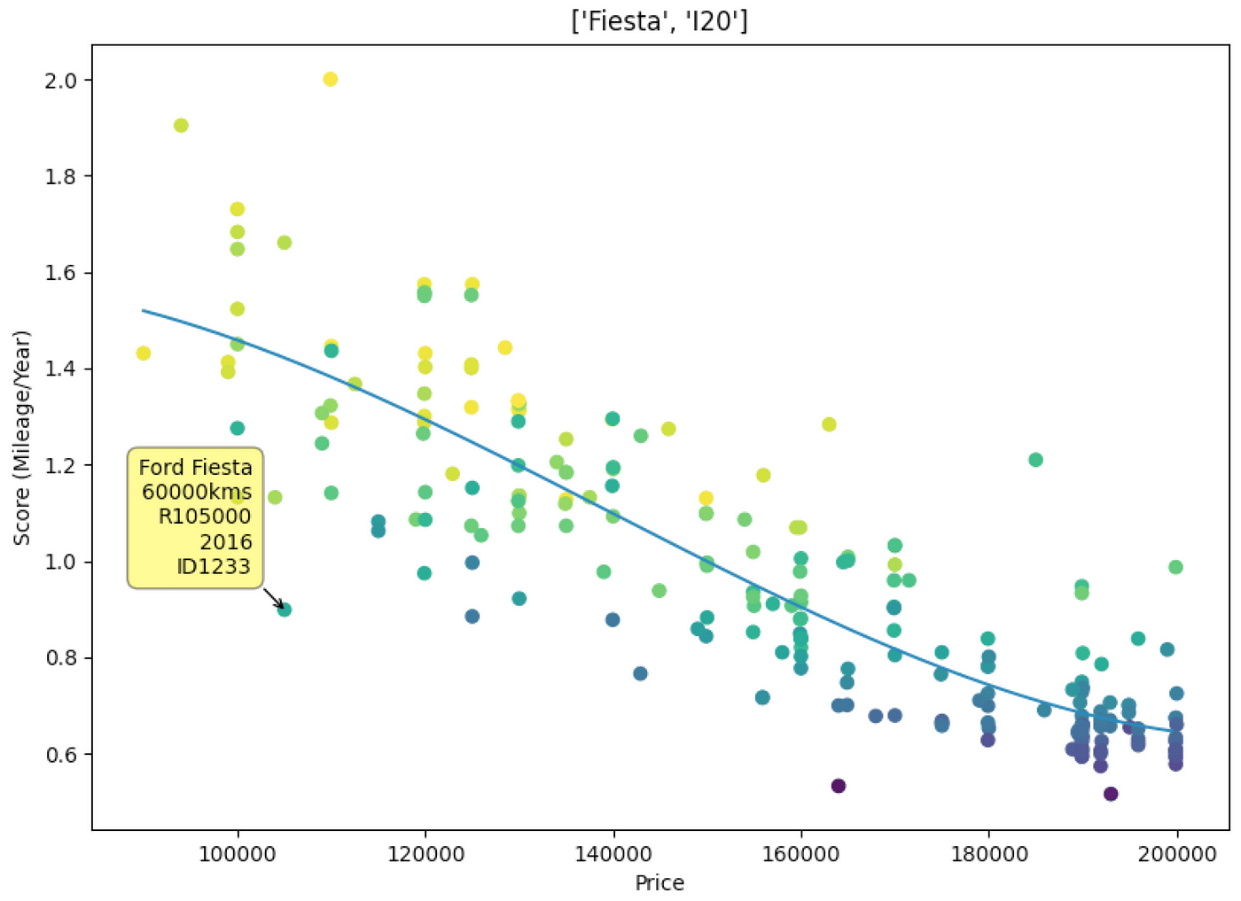
I added some the functionality to select makes and models through the command line flags which makes comparing results a lot easier.


Conclusion
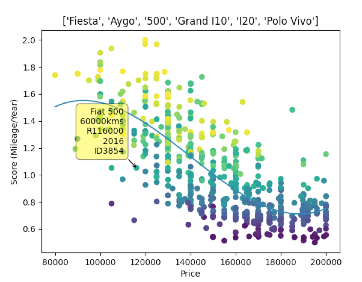
Here is my “final” result, by the time I got here I’d already decided on a car I wanted and thanks to the below I am fairly confident I got a good deal. There are many more factors that go into buying a car other than the data, but having information like this available and easy to digest is extremely beneficial when making big decisions like purchasing a car.
