As a side project I decided to explore some ways to use widgets in relation to banking.
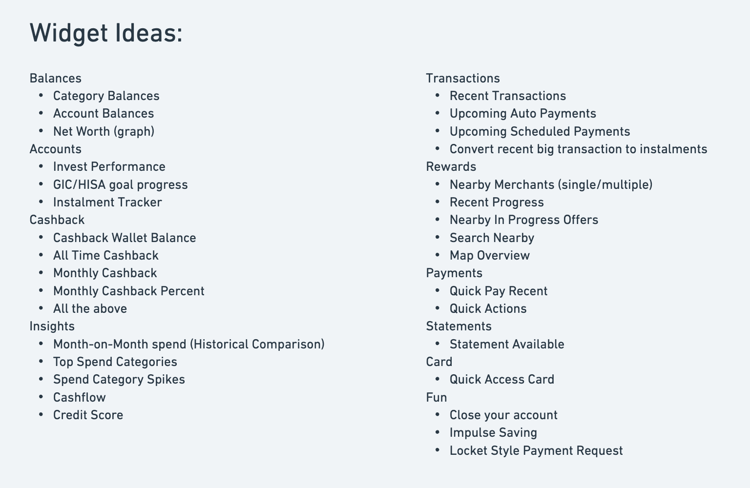
Inventory of ideas

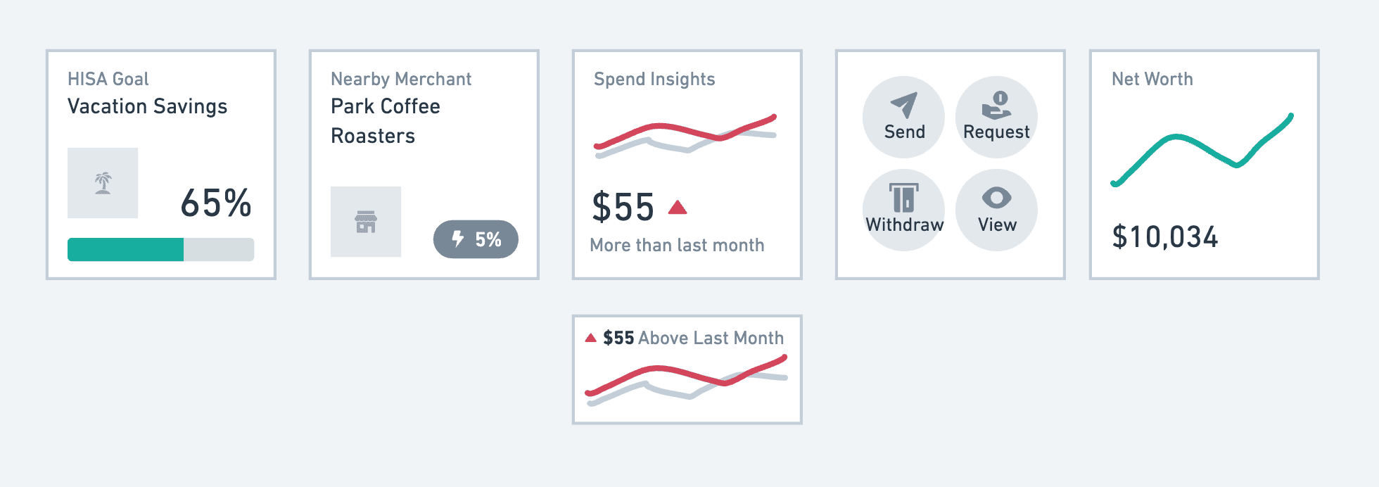
Wireframing Ideas

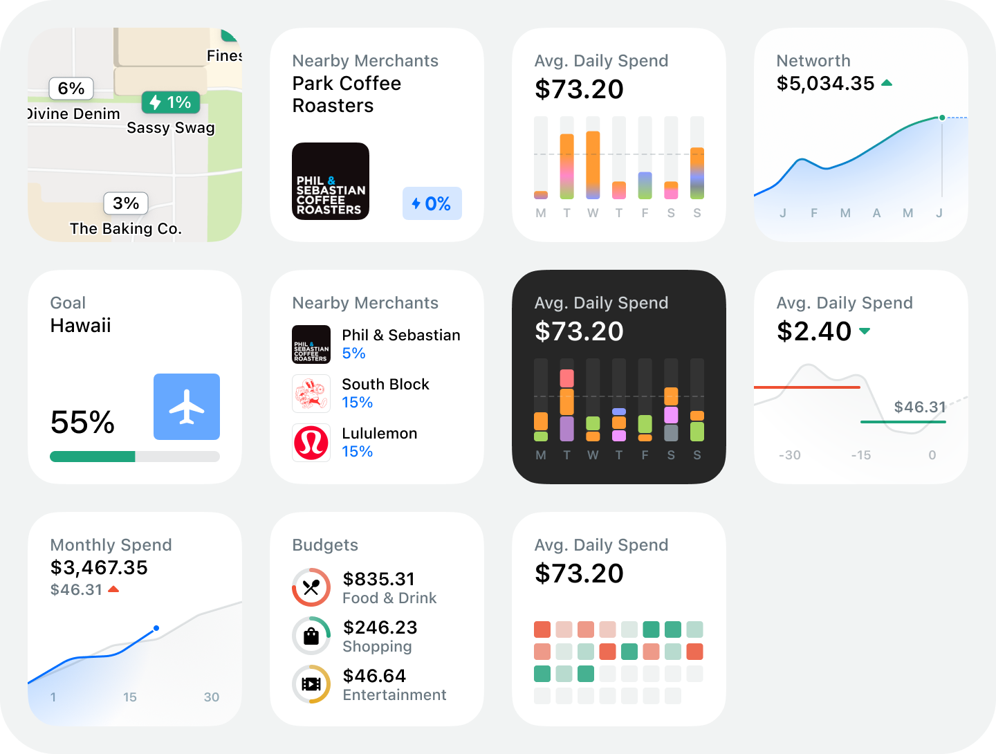
HiFi Mockups
Mocking these up in hifi gives a better feeling of how these could actually be implemented. I've draw heavily from Apple UI (Pay/Health/Fitness) to create widgets that feel native to the platform.

Daily Spend
A big focus of the widget development for me has been coming up with ways to improve users spending habits in simple and intuitive ways. These daily spend widgets are a way for users to become familiar with their daily spend and compete against it.

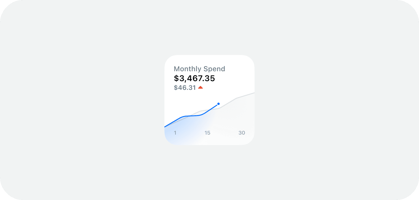
Monthly Spend
Similarly, monthly spend is also an attempt to help users get an intuitive feel for their spending habits rather than settings budgets. Month over month spending is one of the easiest ways to see how you're performing.

Spend Categories
Visualising spend categories is less educational then some of the daily or monthly spend views but can be a visually interesting way to see what your big spending categories are. These could be visualised on different time scales eg. daily or monthly. These mockups draw heavy influence from Apple card.