Addressing Design Debt
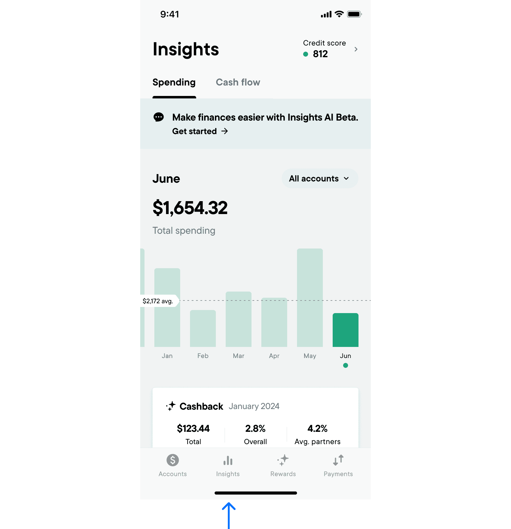
Often times design debt accumulates through a series of disconnected events or decisions. This is one of those cases. As a personal banking fintech app, financial insights is a core feature. How extensive the functionality is is debatable but at the very least core insights is a requirement.
Our Insights tab, which lives as it's own tab in our global bar, as an indication of it's importance, has grown in functionality over time. Consequently the UX has degraded somewhat and it's important to the time every couple months/years to relook at what an ideal user experience might look like.
The Culprits
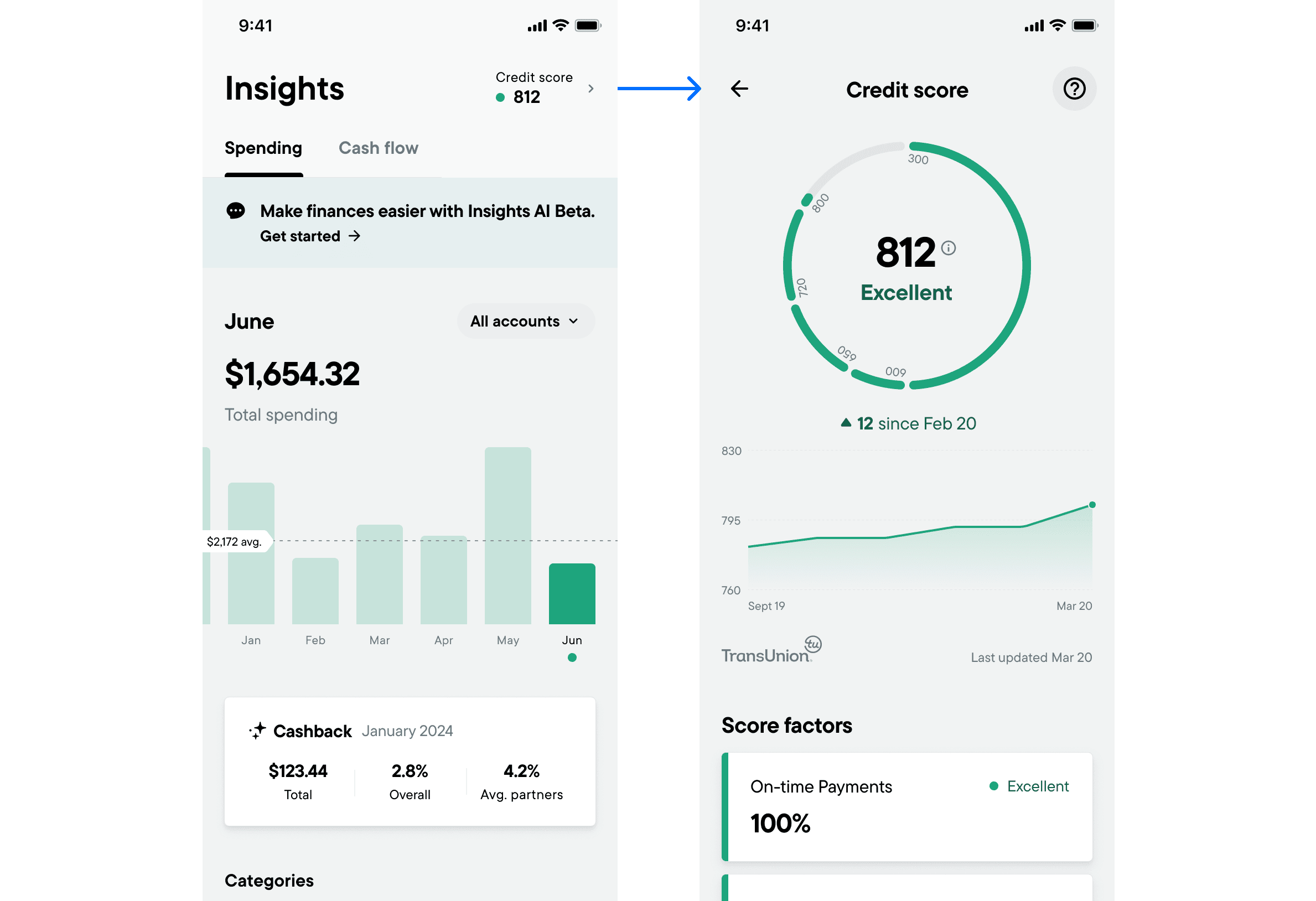
Originally the only functionality of insights was spending insights, ie transactions grouped by spend category. Over a short period we introduced Cash Flow Insights, Credit Score Monitoring and AI Insights. These 3 new features were all competing for space within the insights tab which was already the primary home of Spend Insights.
Pain Points
Tabs
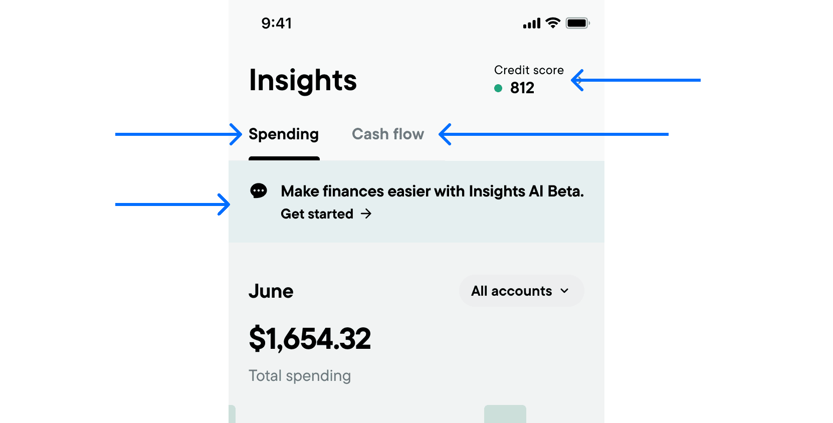
The flat tabular navigation was introduced across the app as the preferred design pattern in an attempt to flatten information over a drill-down or hub-and-spoke design pattern. Although this pattern is effective in certain contexts it wasn't particularly well suited to this use case because...
"Untabable" Content
AI Insights
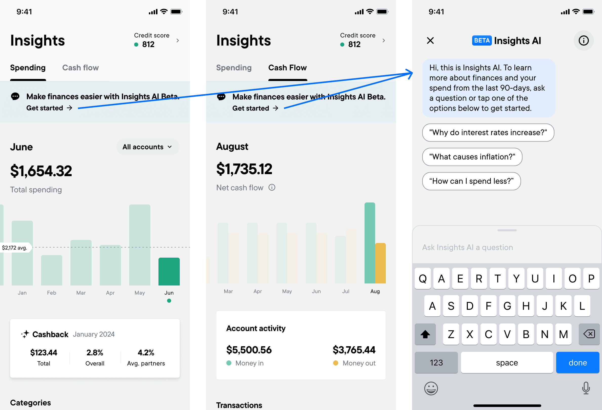
AI Insights took the form of a chat interface which was difficult to implement in a tab from an engineering perspective (as well as being a slightly strange design pattern.) For this reason it was implemented as banner across all tabs. The ultimate goal was to drive engagement/interaction of an exciting new technology so the approach of bringing it in as a high visibility banner was the outcome. You could argue that the banner only needed to exist on the first tab but it does raise the question of where is the insights catchall.
Credit Score
Credit score had a different issue in that we wanted to allow users to see their credit score at a glance to drive engagement(??). For this reason it couldn't exist in a tab, without adding the credit score to the tab itself. The solution here was add an entry point to the navigation to display the credit score at a glance and also, since this was a premium feature, encourage users to sign up for it. You could make the point for adding it to the first tab but this would push down spending insights and again raise the question of where is the insights dashboard.
Cash Flow
Although cashflow living in it's own tab doesn't have any major issues, the placement didn't make it any more accessible than being a simple link.
Bringing Data Up
At this point the solution may be obvious to some but lets talk about progressive disclosure. Simply put progressive disclosure encourages us to surface only the most important information to a user while allowing them to request more specialised options or secondary features to suit their needs.
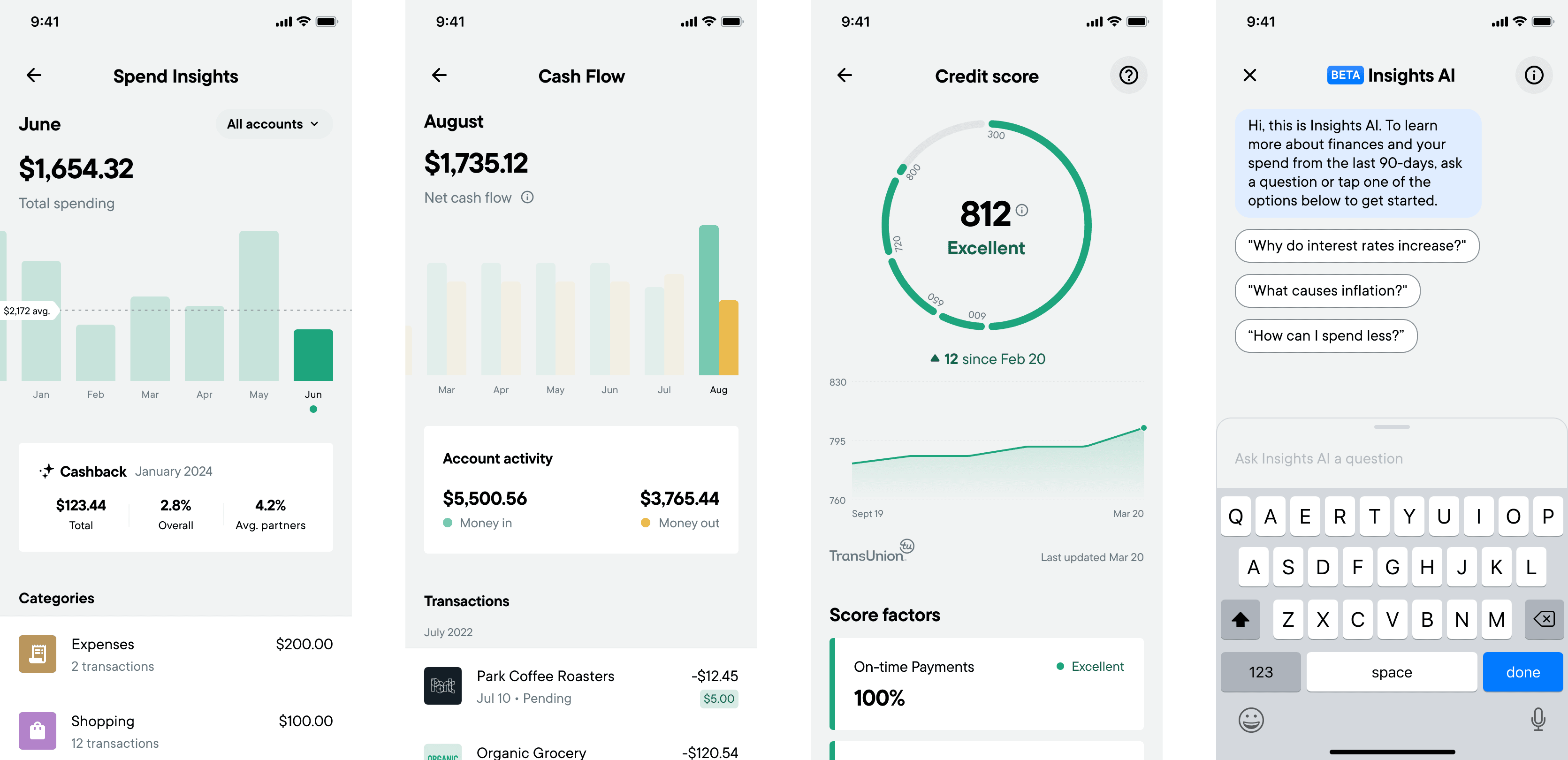
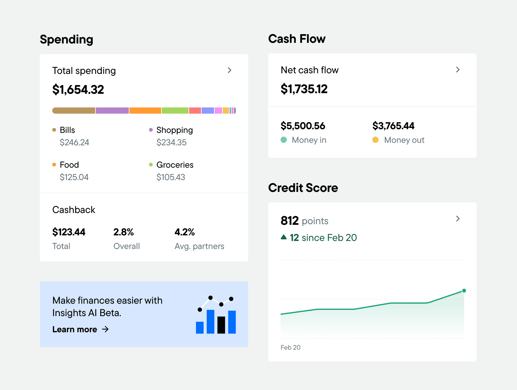
By moving to a hub and spoke (or drill-down) design pattern, we're solve all previous problems. Not only does this allow users to see more essential information at a glance while getting more advanced details at their request, it also reduces clutter through the introduction of consistent tile interface.
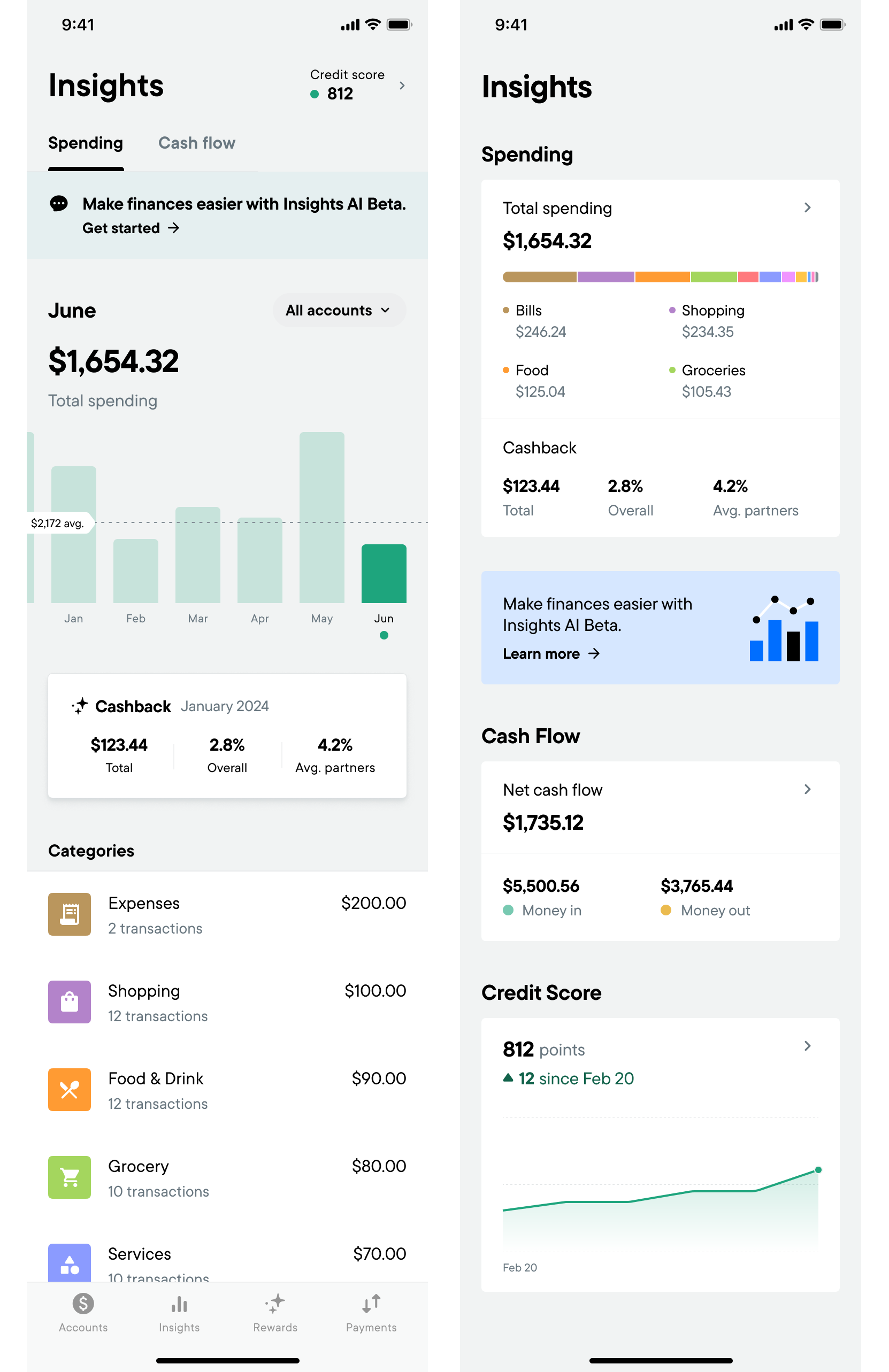
In the before and after above you can see how the important information from each section has been distilled into it's own scannable tile while keeping further details a tap away.
The details pages are also now more focused and less cluttered (although this information could also likely be simplified further.)
