I was recently asked to describe the process behind the design of my Wavehaus font family. While composing the email I thought it might be helpful for other people so I decided to write this blog post instead. Parts of this are a bit fuzzy and I won't go into detail about certain things but I will try to highlight the main points.
Getting Started
I did almost all the design in Illustrator for a few reasons:
- I was more comfortable using the pen/path editing tools in Illustrator than in Glyphs (The drawing tools in Glyphs are actually waaaay better and I wish they were native to Illustrator).
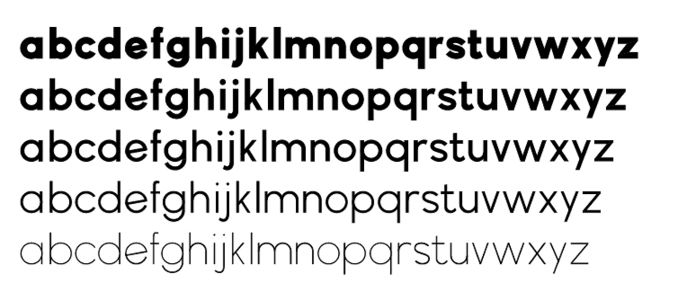
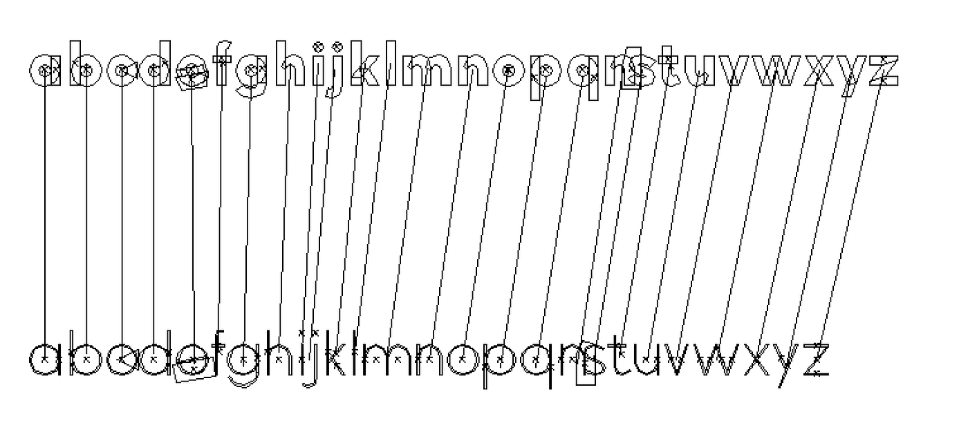
- I knew I was going to be creating multiple font weights through the use of masters. The way masters work is you design a bold and a light weight for example and then through interpolation you can generate the weights in between. Glyphs supports this of course but I thought it would be easier to use the blend tool in Illustrator to see all the weight simultaneously.
Setting up guides
So with Illustrator as my tool of choice I got started. Glyphs has a lot of tutorials and one covers designing in Illustrator. They suggest designing at a minimum size of 500px which is what I used as my x-height.
The majority of font design tutorials recommend starting with the lowercase 'n' and 'o' and the uppercase 'H' and 'O' and then going from there.
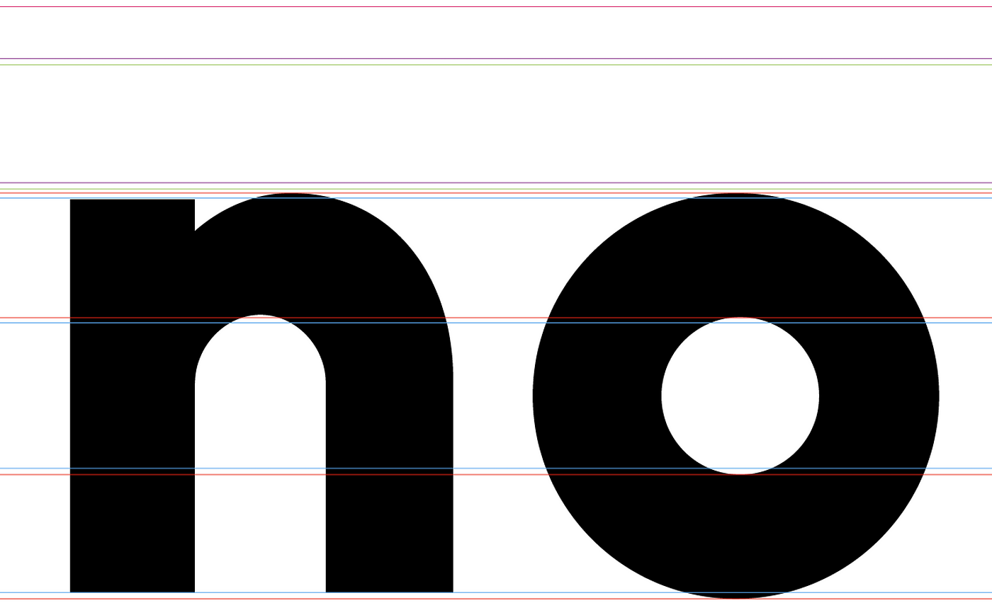
The outer blue lines are the x-height. The outer red lines are for curved shapes. Curved shapes generally overshoot the guides slightly in type design to look proportionally equal. In my case the the 'o' extends 8px at the top and bottom for a total height of 516px. This is arbitrary. The inner red/blue lines are the dimensions for the thickness of characters.
The rest of the guidelines for ascenders/descenders and more came up organically through the process.
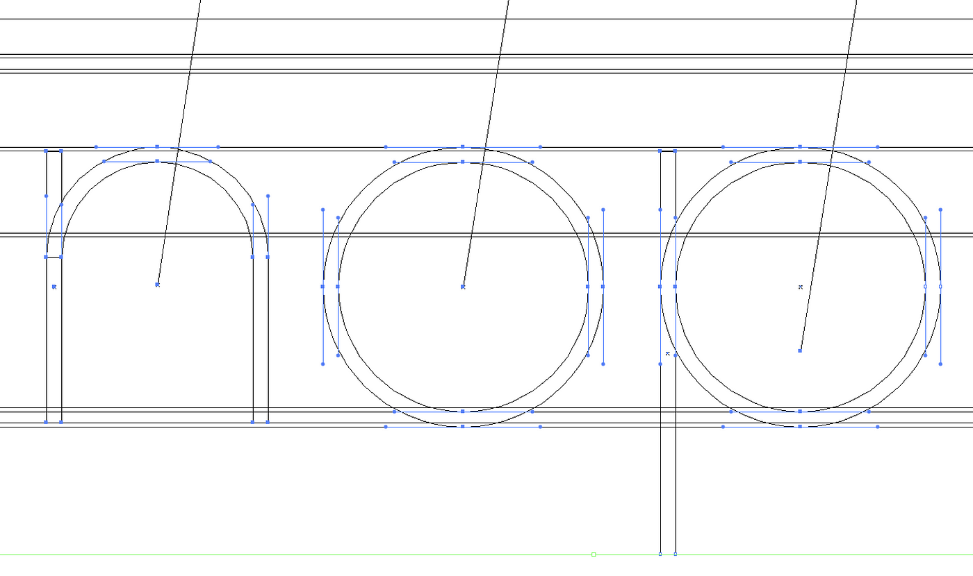
I had a similar grid set up for the thin font weights and designed them simultaneously.
Designing characters
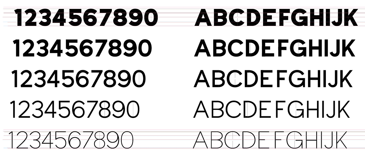
For the majority of the typeface I just drew directly into Illustrator and tried to keep all the weights visually consistent which is another thing using the blend tool helps with. The bold and the light might look fine but if the regular instance is out of proportion you know you need to tweak one of the masters
Sketching
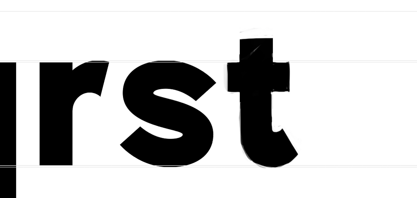
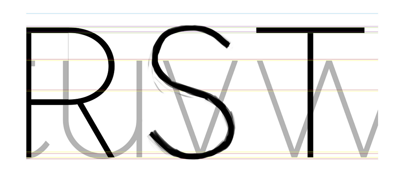
For a few of the more difficult characters I would copy my guides into Photoshop and just freehand sketch the characters alongside the other characters and use this as a base for the vector designs.
Importing to Glyphs
Moving from Illustrator to Glyphs was really time consuming and involved cleaning up my artwork a lot and then copy-pasting into Glyphs, correcting path directions, adding extremes (where necessary) and tidying up paths.

I created the same grid in Glyphs to keep things consistent.

Setting dimensions and sticking to them keeps everything looking nice and uniform.
Bearings & Kerning
This part I actually have the least memory of. I know I used some tools to generate a lot of kerning pairs but for the most part all of this stuff was visual. In the Glyphs tutorials they have a lot of tips for setting this stuff up but I can't remember my exact steps. (I am currently working on a new font so when I get to that point I will be sure to update this article).
Symbols & Diacritics
The symbols were designed in Illustrator the same as everything else. This was probably the hardest part of the process because there's so many unique shapes.


The diacritics were also quite tedious but Glyphs again makes it quite easy to generate these. I drew these straight into Glyphs.
Wrapping up
This was my second attempt at creating a font and was quite an ambitious project (doing a family as opposed to one font) and for the most part I just researched font design and read the Glyphs tutorials (which are super good) and used my eye to try make something balanced and appealing 😄 Here is a sample of my Illustrator file containing some of the the characters Sample File
